
Table of Contents
This comprehensive guide will help you install, set up, and customize your Security Agency Pro theme to build a professional, secure, and engaging website for your security services.
Security Agency Pro Theme Documentation
Introduction
Customizing Your Website
Global Settings
To set global styles:
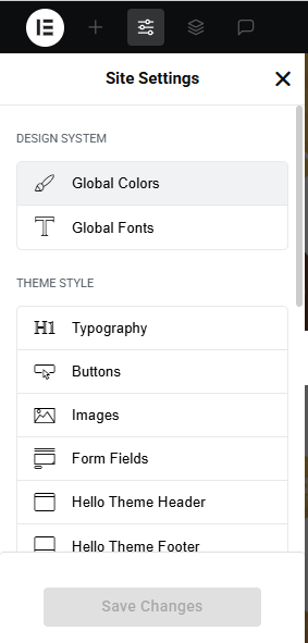
- Go to Elementor > Site Settings.
- Adjust typography, colors, and layout settings.
Header & Footer Setup
- Use Elementor Theme Builder to edit the header and footer.
- Customize the navigation menu, logo, and contact details.
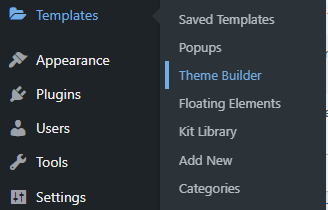

You can drag and drop the elementor widget’s menu first. If you’d like, you can add items or simply drag each one, after which you can add a icon list from the widget and apply a custom style from the style option.
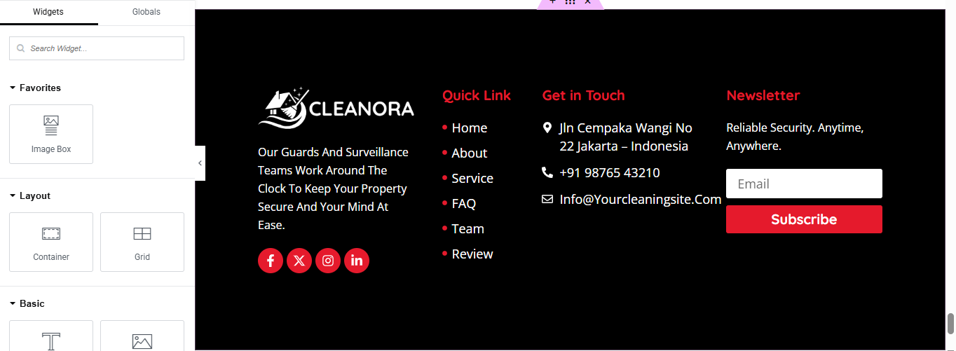
you can add newslatter form, timing, contact details, logo, gallery, menu and if you wish in footer, and create you best design.
Home Page Setup
Using Pre-Built Layouts
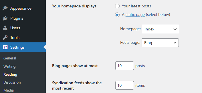
Navigate to Setting >> Reading
Choose the Static Page option.
Choose an existing homepage or create a new one.
Add The Section in home page using elementor
Add components such as these using the Drag & Drop Builder:
- Hero Slider Section
- About Section
- Service Section
- appointment section
- why choose us section
- CTA Section
- achievement section
- FAQ Section
- team section
- review section
- blog section
- partner logoes slider section
Main Hero Section
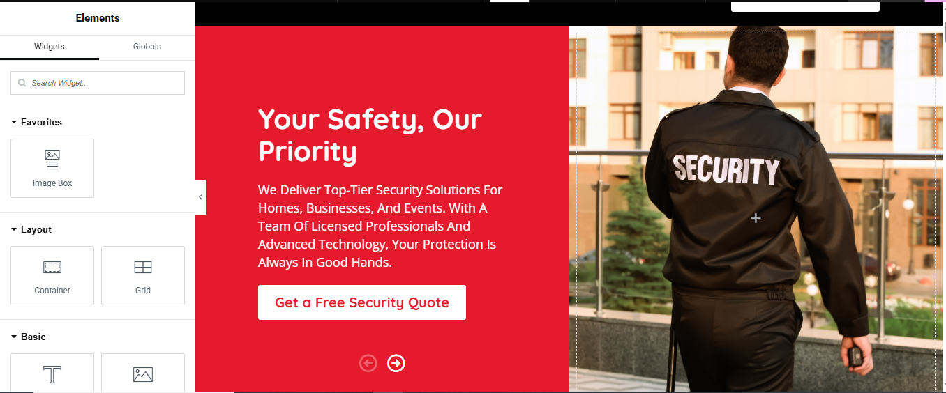
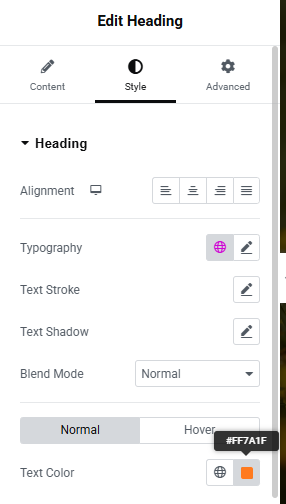
Set Section Background Color
- Go to the Style tab.
- Set the Background Color to #ed1c24 (the red background you see).
Left Column (Text & Button)
- a. Add Heading Widget
- Drag and drop a Heading widget into the left column.
- Text color: #fff (white)
- Typography: Adjust font size (e.g. 40px), font-weight (e.g. 700)
- b. Add Text Editor Widget
- Drag a Text Editor widget under the heading.
- Text color: white
- Typography: font size ~16–18px, line height ~1.6
- c. Add Button Widget
- Drag a Button widget below the paragraph.
- Background color: #fff
- Text color: #ed1c24
- Border radius: 4–6px
- Padding: Adjust for nice spacing
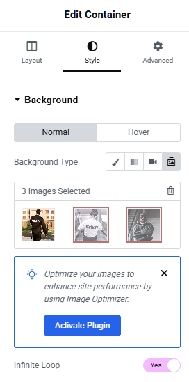
Right Column (background slide show)
About Section
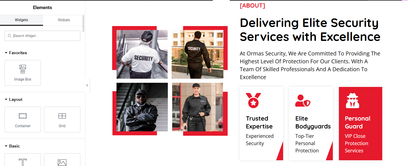
Left Column – Image Grid
- a. Add Inner Section
- Drag an Inner Section widget into the left column.
- b. Add Image Widgets
- In each column, drag and drop an Image widget.
- c. Style the Images
- Go to Style > Border
- Border Type: Solid
- Width: 4px (Top/Left/Right/Bottom)
- Color: #ed1c24 (or the red you’re using)
Right Column – Text Content + Features
- a. Section Label
- Text color: Red (#ed1c24)
- Font weight: Bold or 700
- b. Main Heading
- Style: Black, bold, 35–45px size, line height ~1.2
- c. Paragraph
- Style: Light line height, font size ~16–18px
Service Cards
- a. Add Inner Section Below the Paragraph
- b. Create Cards Using Icon Box or Image Box
- Use Icon Box or Image Box widget.
- Icon (Shield, Bodyguard, Guard etc.)
- Heading
- Description
- c. Styling Cards
- Left & Middle: White (#fff)
- Right: Red (#ed1c24)
- Text Color:
- d. Add Border Radius & Shadow
- Go to Style > Border
- Radius: 10px
- Box Shadow: Subtle shadow for depth
Service Section
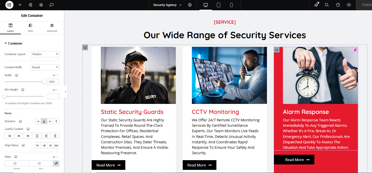
Add Inner Containers for Each Service
- Add a Container Inside
- Inside Each Service Container
- a. Image Widget
- Drag and drop Image widget at the top.
- Upload relevant image
- b. Heading Widget
- Title:
- Style:
- Color: Red (#ed1c24)
- Font weight: 700
- c. Text Editor Widget
- Description paragraph
- d. Button Widget
- Text: Read More →
- Align it to left or center, based on your layout.
- Style Service Card Container
- a. Style Tab
- Background Color (Normal): White
- Padding: e.g., 30px on all sides
- Border Radius: 8–12px
- Box Shadow: Optional (for depth)
- b. Hover Background Effect
- Scroll to Hover under the same Style tab
- Background Color on Hover: #ed1c24 (red)
- Text Color on Hover
Appointment Section
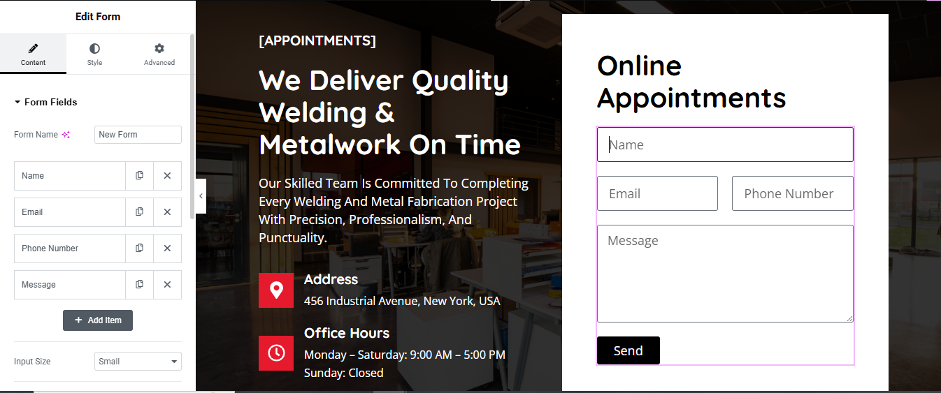
Left Column – Add Appointment Text Content
- a. Add a Heading
- Use a Text Editor or Heading widget.
- b. Add Description
- Use a Text Editor widget for the paragraph.
- c. Add Address & Office Hours
- Use Icon Box widgets or Text Editor with Icons.
- Add location icon and clock icon
Right Column – Add Form
- a. Drag in a Form Widget
- Requires Elementor Pro.
- Fields to add:
- Name, Email, Phone Number, Message
- Use the + Add Item button to include these.
- b. Style the Form
- Go to the Style tab > Form Fields:
- Background: #fff
- Border color: Light gray or subtle purple
- Border radius: 4px
- Padding: 10-15px
Style Submit Button
- Go to Style > Button
- Background color: #000000 (black)
- Text color: White
- Padding: 10px 30px
- Border radius: 4px
- Section Background Styling
- Set the section’s left column background (image or color).
- Left: Background image with dark overlay
- Right: White background for form
why choose us Section
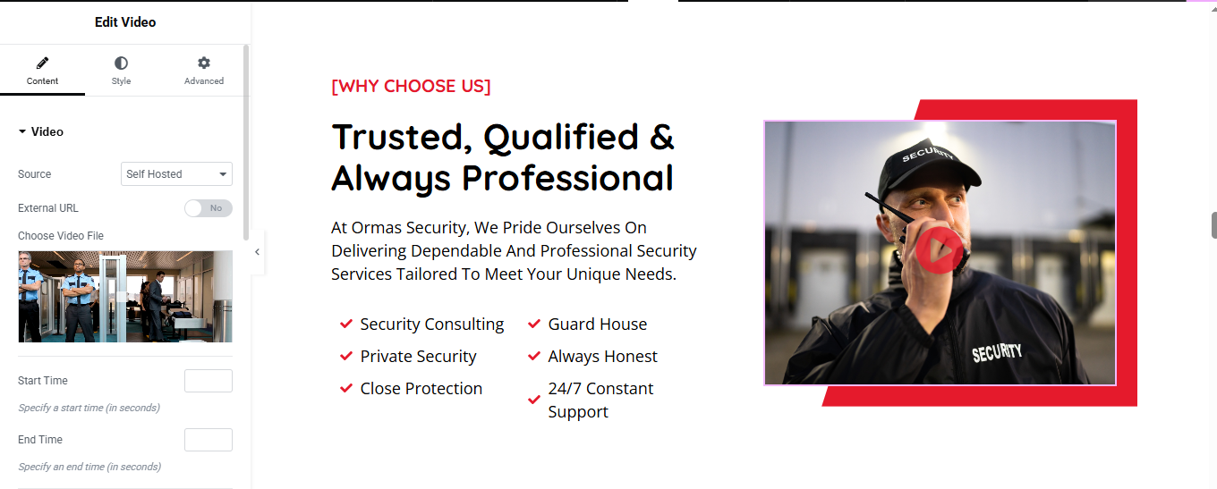
Left Column – Add Content
- a. Section Label and Heading
- Use a Text Editor widget
- b. Paragraph Text
- c. Bullet Points with Icons
- Use a List widget or multiple Icon List widgets:
3. Right Column – Add Video Widget
- a. Use the Video Widget
- Drag the Video widget into the right column.
- Upload your video or paste the URL.
- b. Style the Video
- Add border or box shadow for styling.
- Use Play Button Overlay if needed.
Style the Section
- a. Set Background Color
- Select the section > Style Tab
CTA Section
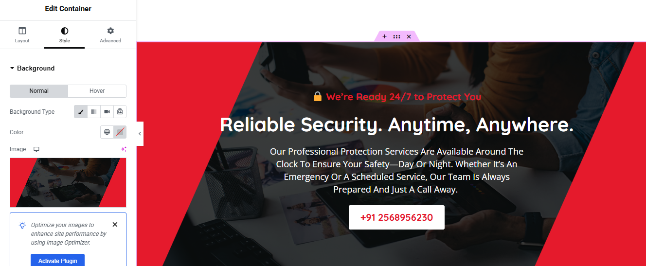
Add the CTA Content
- Top Notice (Text + Icon)
- Add a Text Editor
- Main Heading
- Add a Heading widget.
- c. Paragraph
- d. CTA Button (Phone Number)
Add a Button widget
- Style:
- Background: White
- Text color: Red
- Border radius: 6px
- Padding: 12px 28px
3. Set Background Image and Color
- Click on the Section/Container.
- Go to Style > Background.
- Background Type: Classic
Achievements Section
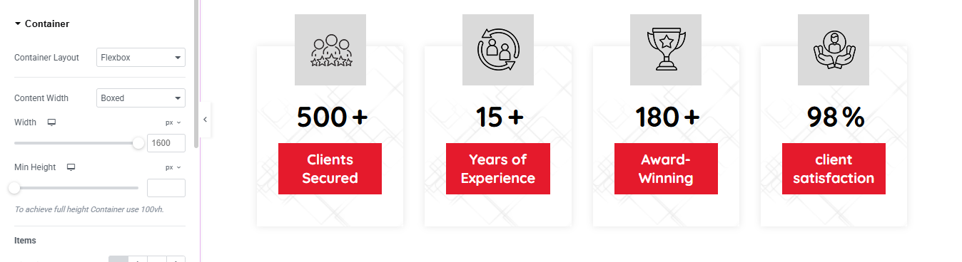
Drag in “Counter” Widgets
- In the Elementor Widgets Panel, search for Counter.
- Drag and drop one Counter widget into each column.
- Edit Each Counter
- Start Number: Usually 0
- End Number: e.g., 150, 2000, etc.
- Number Prefix/Suffix: e.g., +, %, etc.
- Title: e.g., “Happy Clients”, “Projects Completed”
Style the Counters
- Customize:
- Number Color & Typography
- Title Typography
- Spacing
- Alignment (center is most common)
FAQ Section
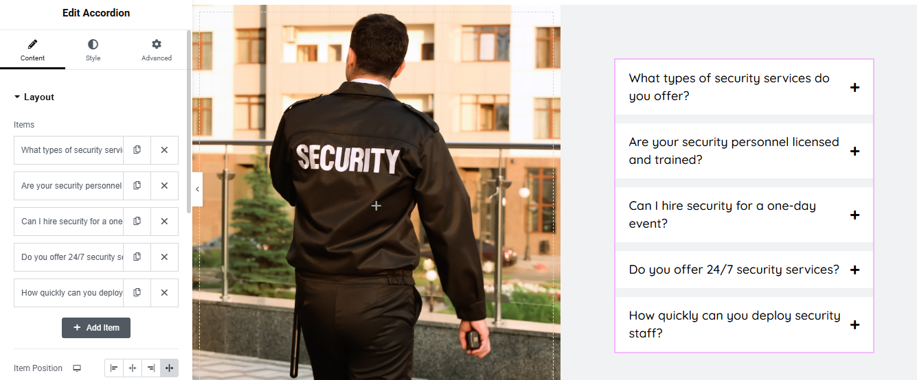
Left Column – Add Image
- Drag an Image widget.
- Upload and insert your security guard image.
- Under Style:
- Set Width to 100%
- Use object-fit: cover if needed
3. Right Column – Add Accordion (FAQ)
- a. Add Accordion Widget
- Drag the Accordion widget into the right column.
- b. Edit Accordion Items
- Set Title
- Set Content/Answer inside the text area
- c. Add More Items
- Click “+ Add Item” to include more FAQs.
4. Style the Accordion
- Go to Style tab:
- Border Width: 1px
- Border Color: Light gray #ccc
- Box Shadow: Optional for depth
- Typography:
- Title: Bold
- Content: Regular
- Icon:
- Set icon size
- Add Hover Background Color Change
- Option 1: Without Custom CSS
- Go to Style > Active & Hover
- Hover Background Color:
- Text Color on Hover: Dark red or black
Style > Accordion > Title > Hover
- Add transition time (e.g., 0.3s)
Team Section Section
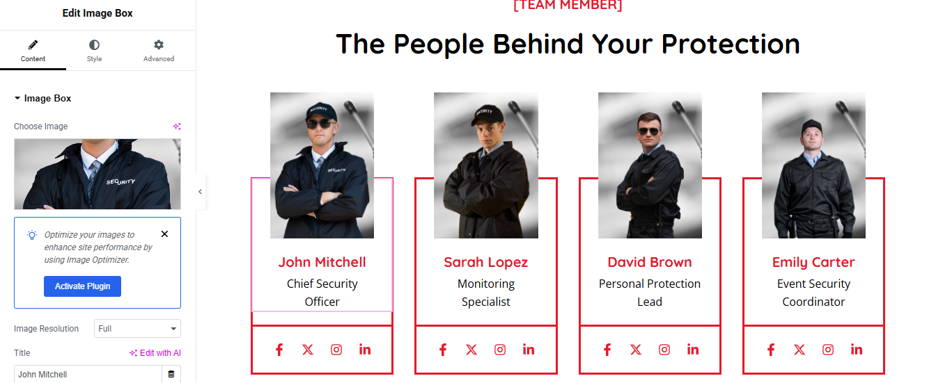
Add a New Section
- Click ➕ → choose 1 Column layout
- Drag in Heading widget → add your Subtitle
- Drag in another Heading → add your Main Title
- Style them (alignment, typography, color) under the Style tab
2. Add Inner Section for Team Layout
- Drag an Inner Section widget below the titles
- Right-click on a column → Duplicate 3 times (you’ll now have 4 columns)
3. Add Team Member Content to Each Column
- For each column:
- Image Widget → Upload team member photo
- Heading Widget → Add Name
- Text Editor → Add Role (e.g., “Senior Electrician”)
- (Optional) Add Social Icons Widget
- (Optional) Add Text Editor for a short bio or description
4. Style the Team Cards
- Select each column or inner section → use the Style tab to:
- Set background color or border
- Add padding for spacing
- Add hover effect if desired
Testimonial Section
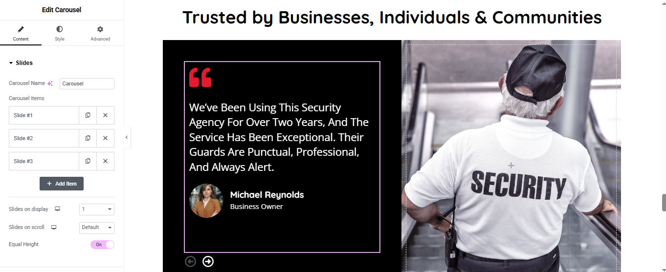
Left Column – Add Carousel (Testimonial)
- a. Add the Widget
- Drag the Slides or Testimonial Carousel
- b. Add Review Slides
- Click on Slides under “Content” tab.
- For each Slide Item, add:
- Quote/Review Text
- Reviewer Name
- Position
- Profile Image
- c. Settings
- Slides on display: 1
- Slides on scroll: Default
- Equal Height: Turn On
- Autoplay: On or off (optional)
Right Column – Add Image
- Drag an Image widget and insert the security guard image.
- Set width: 100%
- Style the Carousel
- Click the Carousel widget
- Go to Style tab:
- Background Color: Black (#000000)
- Text Color: White
- Border: Light purple or white
- Padding: 40px top/bottom, 30px left/right
- Box Shadow: Optional for depth
Blog Section
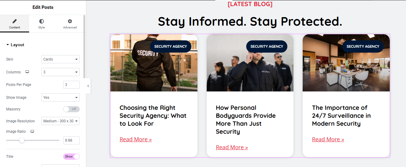
Add Posts Widget
- (Choose method based on Elementor version)
- Elementor Pro (Posts Widget)
- Drag the “Posts” widget into the section.
- Posts will automatically show your latest blog posts.
- Customize:
- Layout: Grid / Carousel / Masonry
- Columns: 2 or 3 recommended
- Show/Hide: Title, Excerpt, Author, Date, etc.
- Image Size: Thumbnail, Medium, Custom
Style the Blog Section
- Use the Style tab to customize:
- Title typography and color
- Card background or shadow
- Read More button style
- Image border radius
Optional Features
- Add Filter by Category (Pro only)
- Add Load More or Pagination
- Add Animations or Hover Effects
Partners Logo Section

Add a Title Heading
- Drag a Heading widget above the carousel.
- 3. Add Image Carousel Widget
- Drag the Image Carousel widget into the section.
- Under Content > Images, click “+” and upload/select all partner logos.
- Set:
- Slides to Show: 4 to 6 (depending on layout)
- Slides to Scroll: 1
- Image Size: Medium or Custom (150px)
- Navigation: None or Arrows
Style the Carousel
- Go to Style Tab:
- a. Image Settings
- Spacing: 20px
- Padding: 10–20px
- Border Radius: 8px
At Security Agency we believe that true protection goes beyond presence — it’s about commitment, vigilance, and trust. With a team of certified professionals, cutting-edge technology, and round-the-clock support, we deliver dependable security solutions tailored to your unique needs. Whether you’re a business, a homeowner, or organizing a special event, you can count on us to stand guard — so you can focus on what matters most.