
Table of Contents
This comprehensive guide will help you install, set up, and customize your AC service Pro theme to create a professional and engaging website for your electric service.
AC Service Pro Theme Documentation
Introduction
This kit is crafted to help you create a modern, professional, and user-friendly website for your air conditioning services. Whether you offer residential cooling solutions, commercial HVAC installations, emergency repairs, or custom climate control systems, this template kit is packed with everything you need to showcase your expertise and attract new customers with ease.
Customizing Your Website
Global Settings
To set global styles:
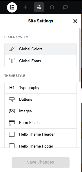
- Go to Elementor > Site Settings.
- Adjust typography, colors, and layout settings.
Header & Footer Setup
- Use Elementor Theme Builder to edit the header and footer.
- Customize the navigation menu, logo, and contact details.
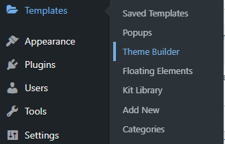

You can drag and drop the elementor widget’s menu first. If you’d like, you can add items or simply drag each one, after which you can add a icon box from the widget and apply a custom style from the style option.
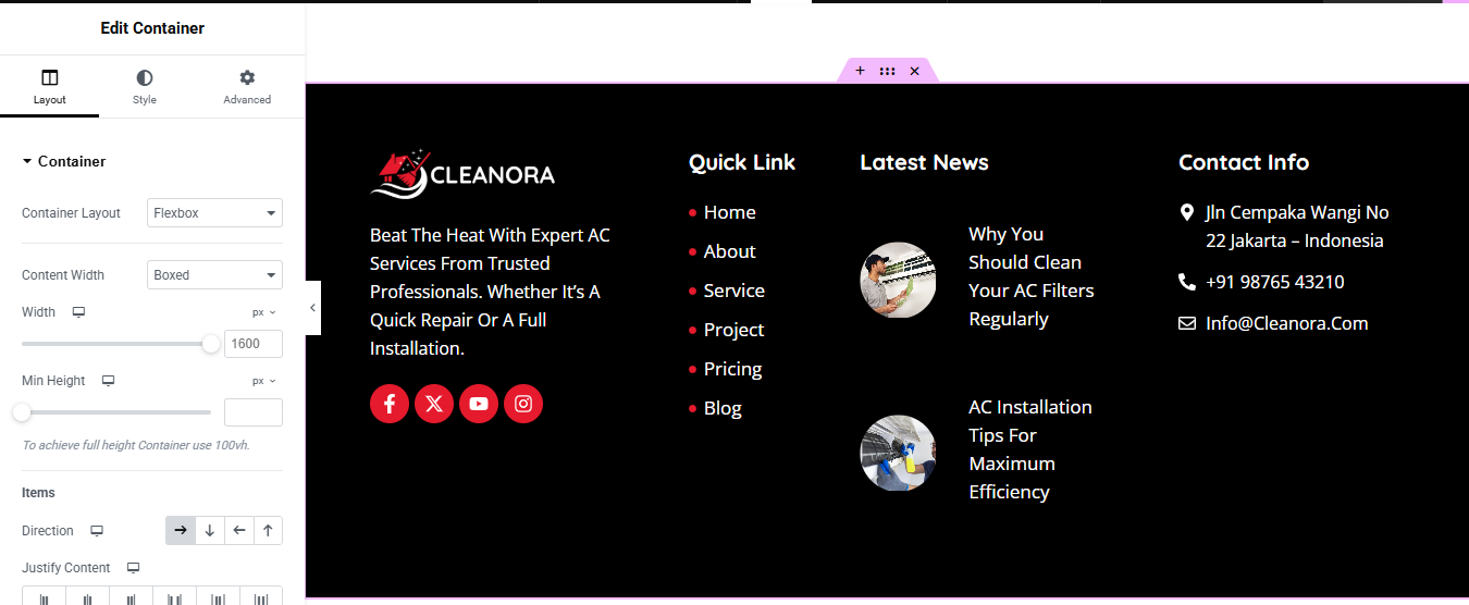
you can add newslatter form, timing, contact details, logo, gallery, menu and if you wish in footer, and create you best design.
Home Page Setup
Using Pre-Built Layouts
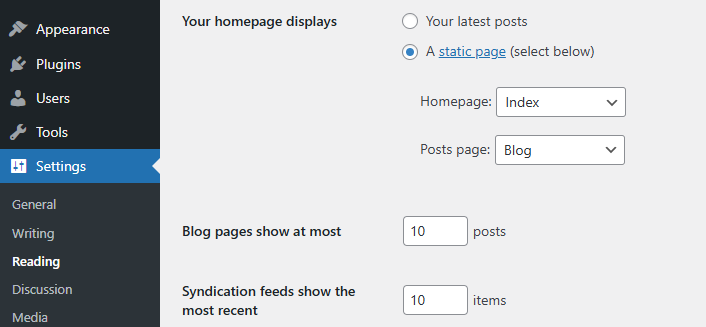
Navigate to Setting >> Reading
Choose the Static Page option.
Choose an existing homepage or create a new one.
Add The Section in home page using elementor
Add components such as these using the Drag & Drop Builder:
- Hero Section
- category list
- about
- achievements section
- services section
- why choose section
- CTA Section
- our projects
- our pricing plan section
- review section
- FAQ Section
- Blog section
Main Hero Section
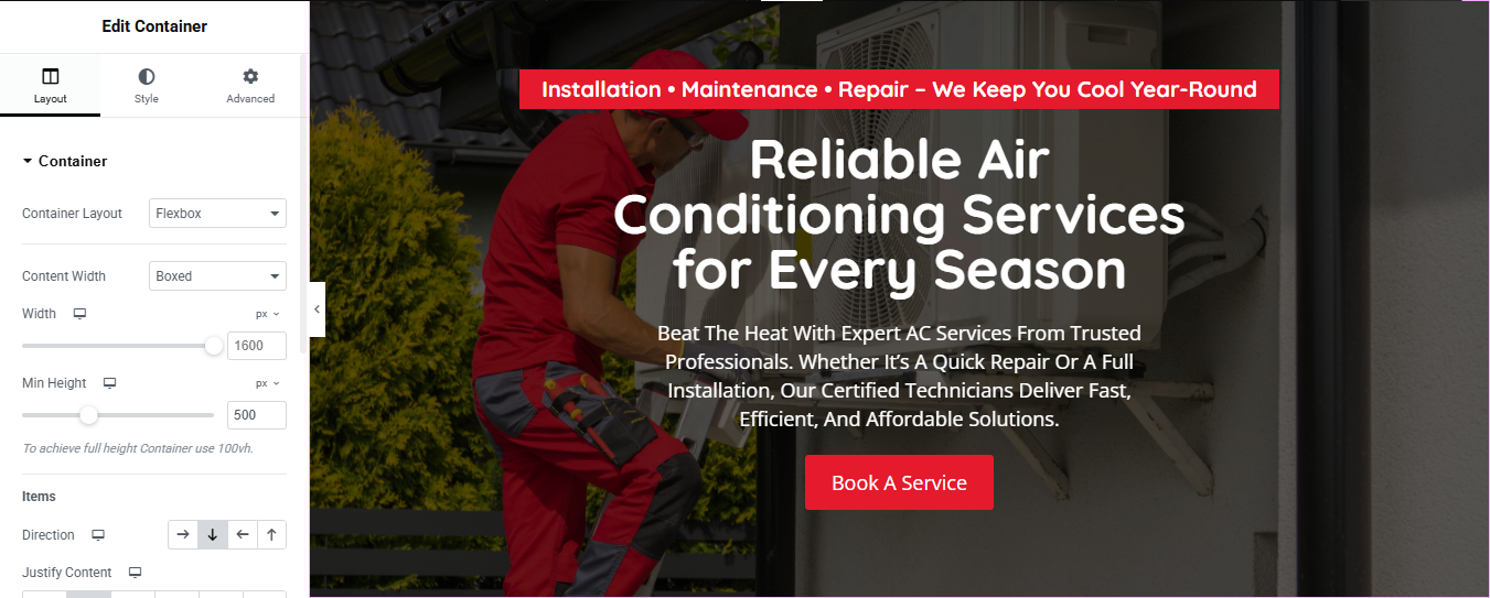
Add a New Section for the Top Bar
- Open your page in Elementor.
- Click the ➕ icon to add a new section above your hero section.
- Choose the one-column layout.
Step 2: Style the Top Bar
- Select the new section (click the blue tab at the top).
- In the Edit Section panel on the left:
- Go to the Layout tab:
- Set Content Width: Boxed (or Full Width if you want it edge-to-edge).
- Set Height: Min Height (optional: 50–70px).
- Go to the Style tab:
- Background Color: Choose Red (#e63946 or similar).
- Typography: Choose white text for contrast.
- Padding: Add 10–20px top/bottom padding if needed.
Step 3: Add Text Inside the Top Bar
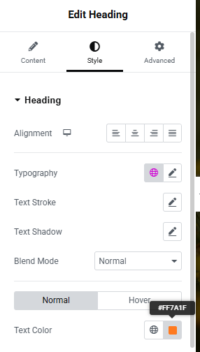
- Drag a Text Editor widget into the new section.
- Style the text:
- Align Center.
- Change font, size, and color to match your branding.
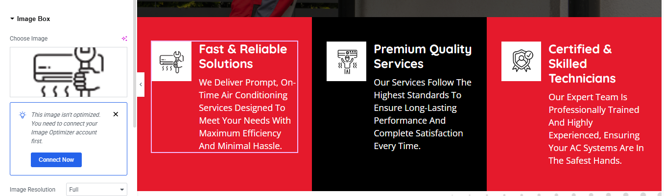
Step 1: Add a New Section with 3 Columns
- In Elementor, click the ➕ Add New Section.
- Choose the 3-column structure.
Step 2: Add an Image Box to Each Column
- In each column, drag in the Image Box widget from the Elementor panel.
- Do this for all three columns.
Step 3: Configure the Image Box Content
- For each Image Box, do the following:
- Set the Icon/Image
- Click the image in the Image Box.
- Upload/select the image (like the AC icon).
- If you get the “Image isn’t optimized” message, you can ignore it unless you are using the Image Optimizer plugin.
Set the Title
- In the Title field, type your heading. Example:
Step 4: Style Each Image Box
- Click the Image Box.
- Go to the Style tab:
Image:
- Size: 80px–100px (adjust as needed)
- Alignment: Center
- Content:
- Title Typography: Bold, white or black
- Description Typography: Normal weight, white or grey text
Step 5: Customize Column Backgrounds
- Go to the Style tab:
- Background → Classic
- Choose background colors:
- Left: Red (#e63946)
- Middle: Black
- Right: Red (same as left)
Step 6: Add Padding & Spacing
- Select each column > Advanced tab.
- Add Padding (e.g., 20–30px on all sides).
- Go to the Section settings:
- Layout tab → Set Content Width to Boxed.
- Gap Between Columns: Adjust to your liking (optional).
About Section
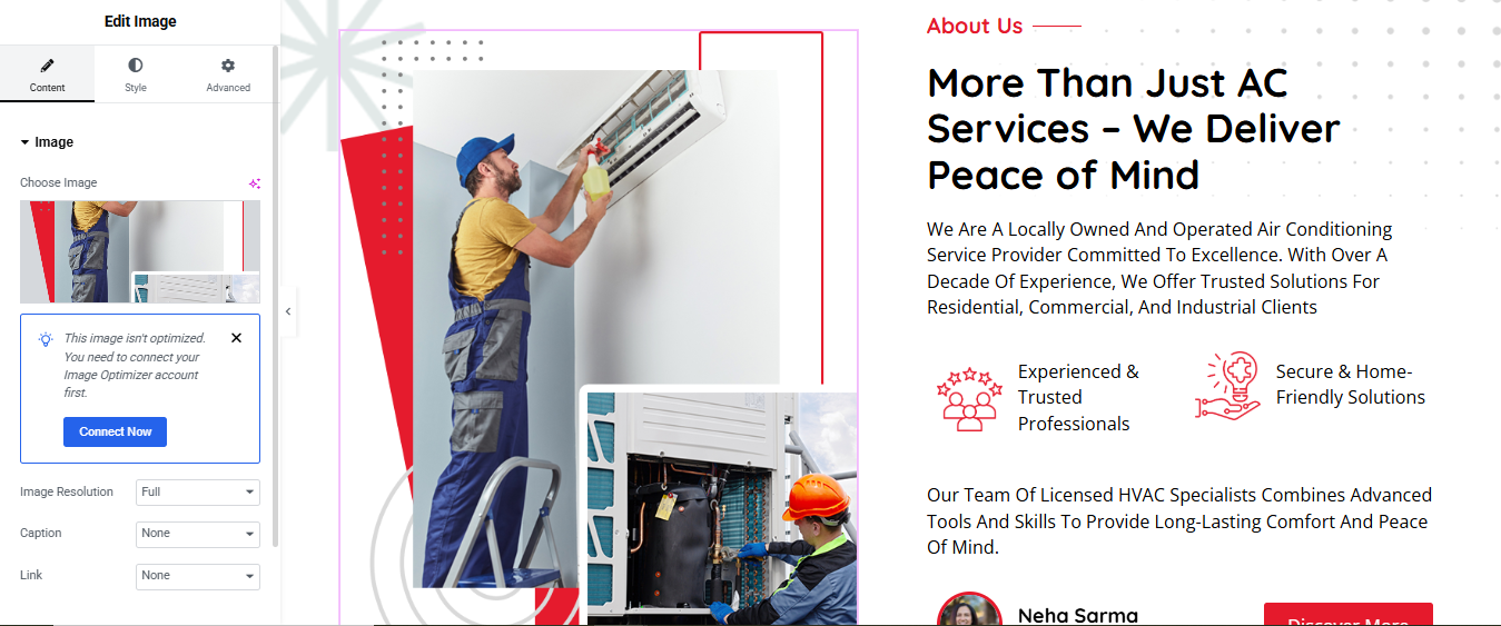
Add a New Section
- Click the ➕ icon → select a two-column layout (50/50).
- Set Content Width to Full Width for a clean, wide layout.
2. Left Column — Insert Image
- Drag and drop the Image widget.
- Upload or choose your photo.
- Align it (e.g., center or full height) under the Style tab.
- For full vertical stretch: Section settings → Height: Min Height, e.g., 600px Image → Advanced → set Vertical Align: Middle
3. Right Column — Add Text and Content
- Subtitle: Drag a Text Editor or Heading widget Set it as smaller text like “Who We Are”
- Title: Add a Heading widget Use a strong headline like “Trusted Experts in Electrical Services”
- Icon Boxes (Two):
- Drag in an Inner Section into the right column → make it 50/50.
- In each column, drop an Icon Box widget:
- Bullet Points: Add a Text Editor or use the List widget Example:
- Button: Drag in a Button widget labeled “Learn More” Link it to your About page or contact form
Achievements Section
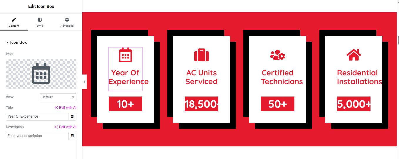
Drag in “Counter” Widgets
- In the Elementor Widgets Panel, search for Counter.
- Drag and drop one Counter widget into each column.
- Edit Each Counter
- Start Number: Usually 0
- End Number: e.g., 150, 2000, etc.
- Number Prefix/Suffix: e.g., +, %, etc.
- Title: e.g., “year of experience”, “AC Units Serviced”
Style the Counters
- Customize:
- Number Color & Typography
- Title Typography
- Spacing
- Alignment (center is most common)
Services Section
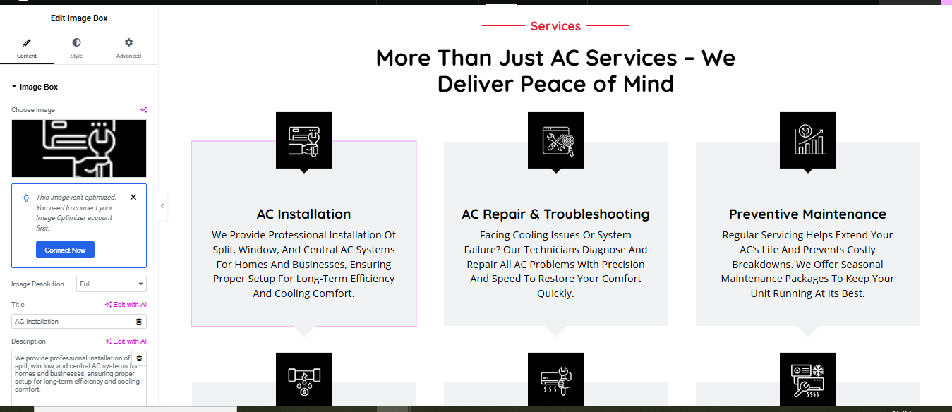
Step 1: Add a New Section
- In Elementor, click the ➕ Add New Section.
- Choose the three-column layout.
Step 2: Add Heading and Subheading
- Style Tips:
- Use center alignment
- Add spacing/padding as needed under the Advanced tab
Step 3: Add Image Boxes for Services
- Inside each of the 3 columns, drag an Image Box widget.
- Configure each:
- Image: Upload your icon
- Title:
Step 4: Style the Service Boxes
- Click the Image Box, go to the Style tab.
- Image:
- Size: 80px–100px
- Alignment: Center
- Content:
- Title: Bold, black
- Description: Regular or light font
- Add Box Shadow and Border Radius if you want a soft card look.
Step 6: Add Padding and Spacing
- Click the column or Image Box.
- Go to Advanced tab:
- Add padding (e.g., 20–40px) for spacing inside the box.
- Add margin between boxes if needed.
Why Choose Us
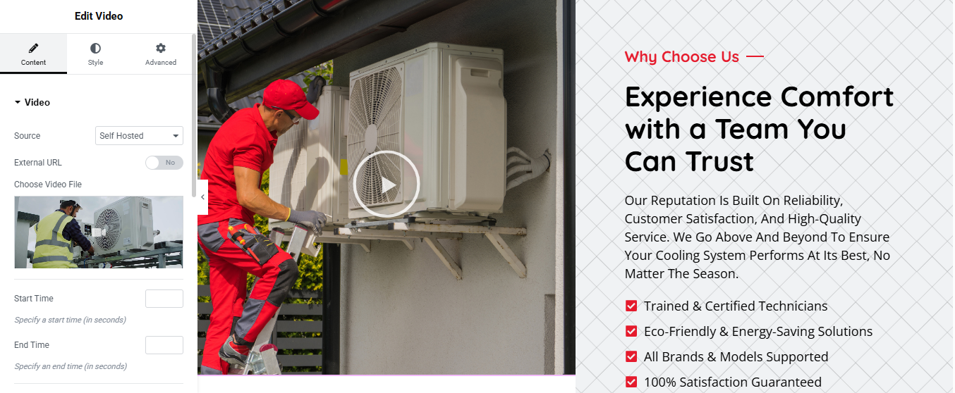
Step 1: Add a New 2-Column Section
- Choose the two-column layout.
Step 2: Add a Video Widget (Left Column)
- Drag the Video widget into the left column.
- Source: Self Hosted
- Choose Video File: Upload your video (as shown in your screenshot)
- (Optional) Set Start Time and End Time
- In the Style tab:
- Adjust width if needed
- In the Advanced tab, add padding/margin for spacing.
Step 3: Add Heading & Text (Right Column)
- 1. Drag a Heading widget:
- Text:
- Style: Use red text or custom color
- Optionally add a line or icon
- 2. Drag another Heading widget:
- Text:
- Set HTML Tag to h2 or h3
- Style:
- Font size: Large (32–40px)
- Weight: Bold
- Align: Left
- 3. Drag a Text Editor widget:
- Paste your paragraph text:
Step 4: Add Checklist Items
- Drag an Icon List widget below the paragraph.
- Add these list items:
- Customize each:
- Icon: Use checkmark or custom image
- Color: Red for icons, dark or black for text
- Style the list for spacing and alignment
CTA Section
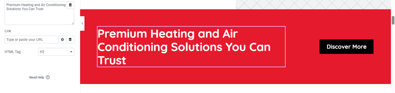
Step 1: Add a New Section
- Choose the 2-column layout.
Step 2: Style the Section Background
- Go to the Style tab:
- Background Type: Choose Classic
- Set a solid red color (like #e50914 or your brand red)
- Add Padding: e.g., 40px top & bottom for space
Step 3: Add and Style the Heading (Left Column)
- Drag a Heading widget into the left column.
- In the Content tab:
- Text:
- In the Style tab:
- Text color: White
- Typography:
- Font size: ~36px (adjust as needed)
- Weight: Bold
Step 4: Add a Button (Right Column)
- Text:
- Link: Add your target URL (e.g., /services)
- In the Style tab:
- Background Color: Black (#000)
- Text Color: White
- Typography: Bold font
- Border Radius: ~8px (for rounded corners)
- Add hover effect: lighter background or scale animation
Our Project Section
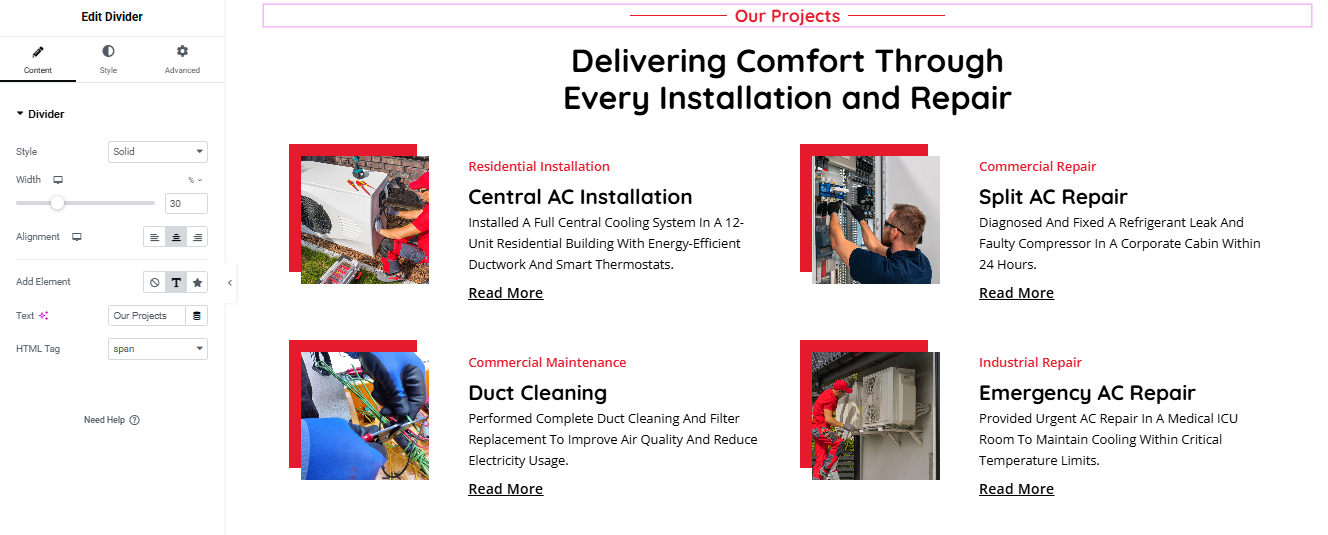
Step 1: Create the Section
- Select a 2-column layout.
- Add inner sections inside each column
Step 2: Add Section Title and Divider
- Drag a Divider widget above the section.
- Style: Solid
- Width: 30%
- Center-align the text
- Text Color: Red
- Below the divider, drag a Heading widget:
- Align: Center
- Set HTML Tag: H2
- Style: Large font, bold, black
Step 3: Create Each Project Card
- For each project (4 in total), follow these steps:
- Inside one column of an Inner Section:
Image Widget - Drag in the image (project photo)
- Add a custom red shape (optional background or using image overlay)
- Heading Widget (Category)
- Color: Red
- Font Size: Small (e.g., 14px)
- Weight: Bold or Medium
- Heading Widget (Project Title)
- Font Size: Medium to Large (18px–22px)
- Font Weight: Bold
- Text Editor Widget (Description)
- Short paragraph describing the project
- Text Editor Widget or Button (Read More)
- Style: Underlined or bold
- Optional: Link to project detail page or pop-up
Step 4: Style for Consistency
- Spacing: Use padding/margin around each card
- Background/Border: Optional subtle shadow or border around cards
- Text Alignment: Left-align all project text
Pricing Plan Section
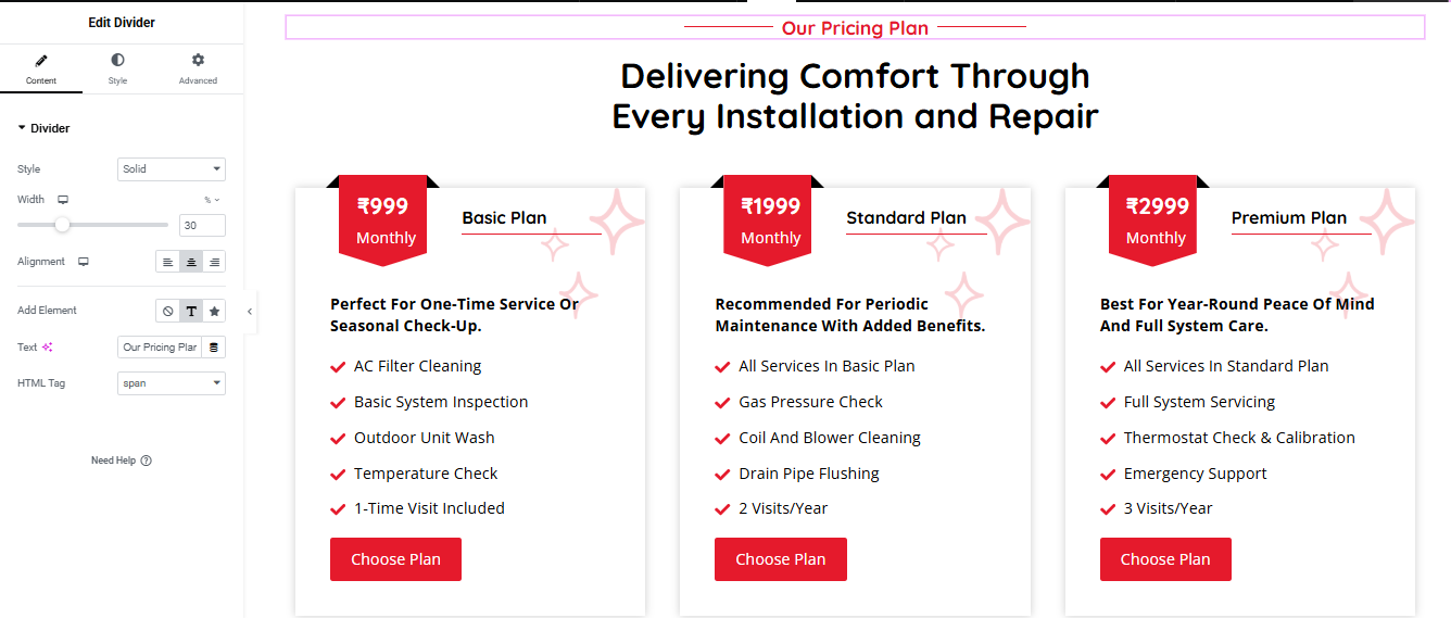
Step 1: Add Section Layout
- Choose the 3-column structure.
- In the middle panel, set:
- Content Width: Boxed or Full Width
Step 2: Add Divider & Section Title
- Add Divider (Top):
- Drag the Divider widget to the top of the section.
- Add Heading (Title):
- Drag a Heading widget below the divider.
- Align: Center
- Typography: Large, Bold, Black
Step 3: Build Each Pricing Card
- Top Price Badge
- Drag a Text Editor widget.
- 3. Plan Name
- Add a Heading widget (e.g., “Basic Plan”).
- Centered, bold, black
- Add red divider line below text if desired using a Divider widget.
- 4. Plan Description
- Use Text Editor widget
- Bold intro sentence
- Add paragraph text for the purpose of the plan
- 5. Features List
- Use a List widget or multiple Text Editors with checkmark icons:
- Use inline icons (✔ or FontAwesome)
- Color: Red for icons, Black for text
- 6. Button (Choose Plan)
- Drag a Button widget
- Color: Red (Background), White (Text)
- Size: Medium
- Border Radius: Slightly rounded
Step 4: Style the Cards
- Border Radius: ~10px
- Box Shadow: Subtle
- Spacing: Add padding inside each column
- Hover Effect (optional): Slight shadow or scale effect
Testimonial Section
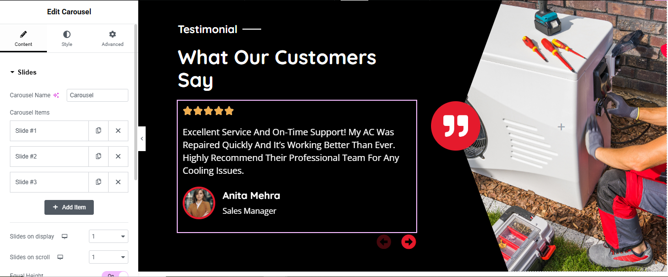
Step 1: Add a Two-Column Section
- Choose a 2-column layout.
- In the section settings:
- Content Width: Full Width
- Column Gap: No Gap (or Narrow)
Step 2: Style the Background
- Left Column (Black Background):
- Click the left column handle.
- Under Style > Background:
- Right Column (Image):
- Click the right column handle.
- Under Style > Background:
- Type: Classic
- Image: Upload your desired background (AC repairman image)
Step 3: Add the Carousel Widget (Left Side)
- Use: “Slides” or “Testimonial Carousel” Widget
- Drag the Slides / Carousel / Testimonial Carousel widget into the left column.
- Go to Content > Slides:
- Add 3+ items.
- For each slide, include:
- Client Quote
- Star Rating
- Client Name
- Job Title
- Client Image
Step 4: Add and Format Content
- Add Section Title
- Add Main Title
- Style Each Slide:
Step 5: Carousel Settings
- Under Content > Settings:
- Slides on Display: 1
- Slides on Scroll: 1
- Loop: Yes
- Autoplay: Yes (optional)
- Navigation: Arrows and/or Dots
- Transition: Fade or Slide
FAQ Section
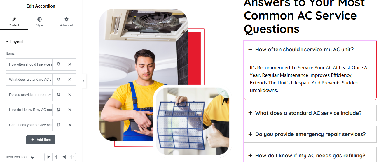
Step 1: Add a Two-Column Section
Step 2: Add Visuals (Left Column)
- Drag Image widgets into the left column.
- Upload images (AC technician, air filter, etc.).
- To achieve overlapping or styled effects:
- Use custom border radius for rounded edges.
- Use margin/padding adjustments or absolute positioning under Advanced > Positioning for layering.
Step 3: Add Accordion Widget (Right Column)
- Drag the Accordion widget into the right column.
- Under Content > Layout, you can:
- Add new FAQ items by clicking + Add Item
- Edit the question (Title) and answer (Content) for each
- Rearrange the order as needed
Step 4: Style the Accordion
- Go to Style tab of the Accordion widget.
- Adjust the following:
- Border Color: Light gray for inactive, red for active (as shown)
- Text Color: Black or dark gray
- Typography: Set font size, weight, spacing
Blog Section
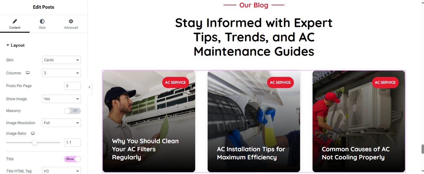
Add Posts Widget
- (Choose method based on Elementor version)
- Elementor Pro (Posts Widget)
- Drag the “Posts” widget into the section.
- Posts will automatically show your latest blog posts.
- Customize:
- Layout: Grid / Carousel / Masonry
- Columns: 2 or 3 recommended
- Show/Hide: Title, Excerpt, Author, Date, etc.
- Image Size: Thumbnail, Medium, Custom
Style the Blog Section
- Use the Style tab to customize:
- Title typography and color
- Card background or shadow
- Read More button style
- Image border radius
Optional Features
- Add Filter by Category (Pro only)
- Add Load More or Pagination
- Add Animations or Hover Effects
Whether you need a one-time seasonal check-up or full-service maintenance throughout the year, our expert technicians are here to deliver comfort, efficiency, and peace of mind. From basic inspections to emergency repairs, we’ve got you covered. Choose the plan that suits your needs and experience hassle-free air conditioning service like never before.